2022 KITCHEN COLOR TRENDS

By now an annual ritual, the Cuisines Steam design team met last November to define the color trends for the coming year.
After a busy year filled with exciting projects, the designers' choices concentrated on five color families; whites, beiges, greens, blues and blacks. This palette focuses on sober and rich shades. It highlights deep and luminous tones, inspiring a true return to nature. Accessible, timeless colors that are perfect for everyday life!
Together with our workshop team, a total of 15 colors were developed. Unique blends, color recipes carefully created for you, for your future kitchen.
Discover our 2022 trend colors
The Whites
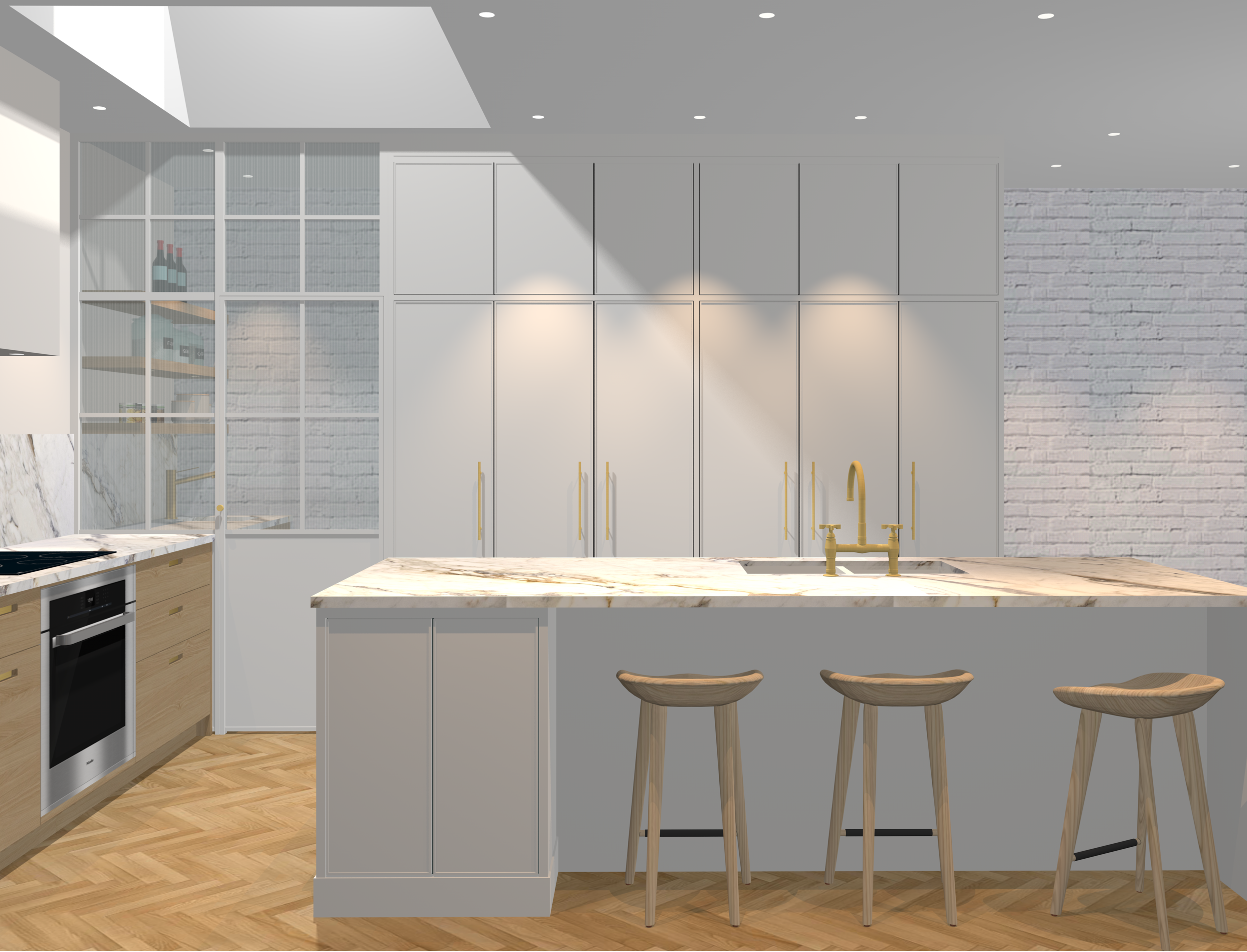
White kitchens are far from being boring! The color white is considered to be more of a value than a real color. It allows a room to breathe and also softens other sharper shades. Master in the art of making textures and other materials such as wood, porcelain, etc. shine, it also has the power to make narrower spaces feel larger and illuminate darker rooms.
Along with gray, it is probably one of the most complex colors to develop. Sometimes too cold and pristine, sometimes too warm and dusty, white must be synonymous with balance, a challenge that our team has taken up brilliantly. Here are three new whites that are now part of our classics and will become your kitchen allies.
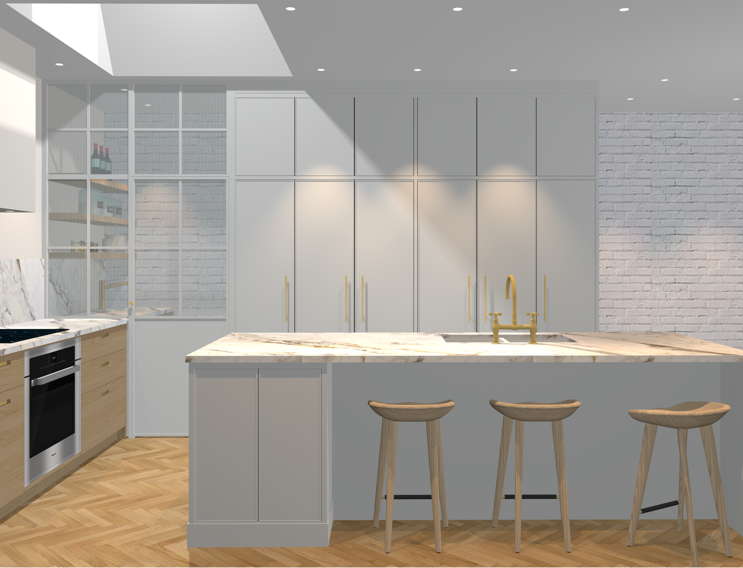
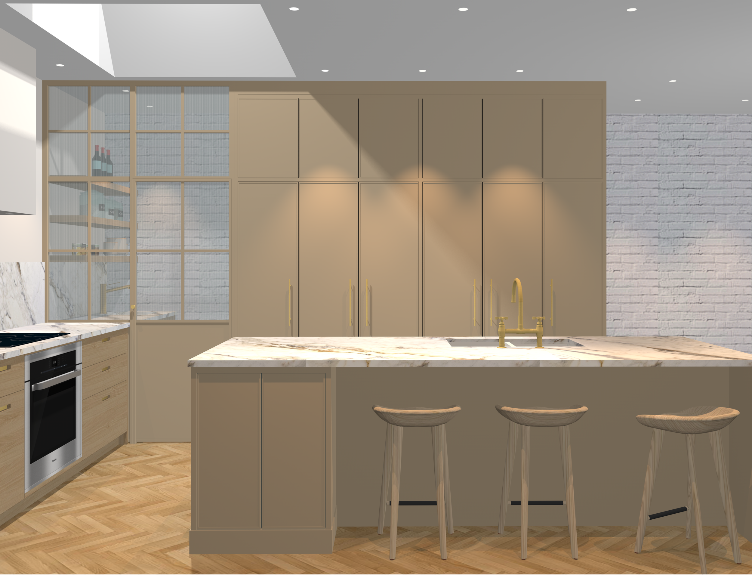
Soap
A warm white revealing light creamy shades of coffee with milk. A soft, subtle and peaceful color, soap, pairs perfectly with cooler and more saturated hues. It's a new staple!
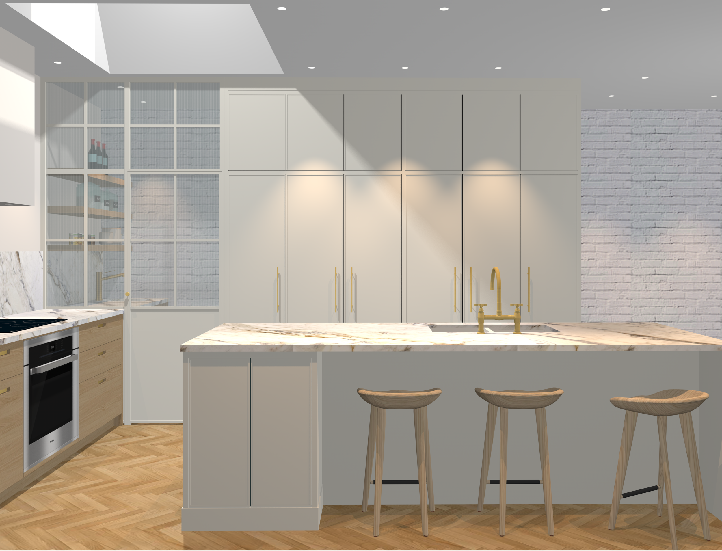
Crisp
With its gray undertone, crisp let’s in a cool breeze, reminiscent of crisp cotton sheets hanging on a clothesline. In juxtaposition with warmer hues, it is the color of choice for a modern and refined look.
Hay
Our warmer shade of white with a touch of yellow, the color of a wheat field in full summer sun. Hay, one of our new favorite colors, will make your decor shine even on the grayest days.
The Beiges
Like white, beiges can go with all styles of decor. Beige serves as a canvas by dressing rooms in an elegant and comforting way. A little forgotten in recent years, it is making a comeback in our 2022 trend color palette.
To tame beige is to adopt it! A true chameleon, it can also be combined with a wide variety of colors. Warmer than pure whites, shades of sand and sandstone are timeless and provide a cozy feeling in the heart of your home. We offer three beige variations advocating simplicity and blending in perfectly in contemporary decors.
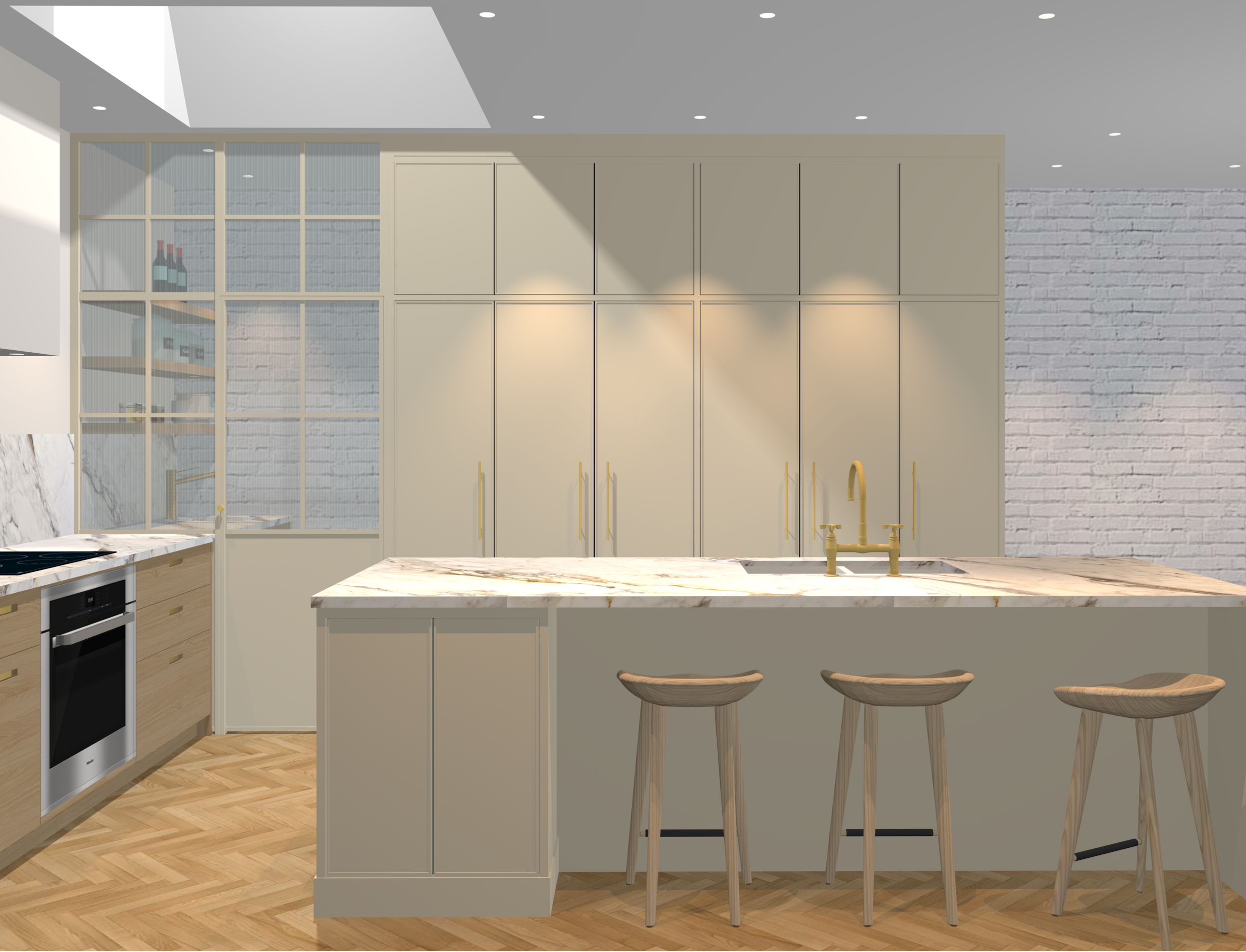
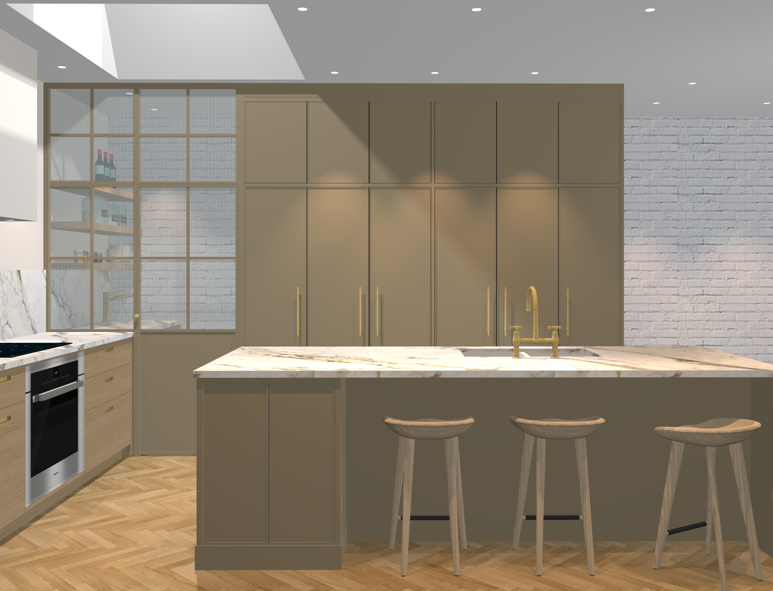
Pampas
A delicate and enveloping beige. The color of long grass stems that reflect a soft light on a snow covered winter day. For those looking for a trendier alternative to white without sacrificing longevity.
Express
A tribute to the restaurant L'Express on rue St-Denis in Montreal, this beige is more pronounced, reminiscent of the chic vibe of Parisian interiors. A shade filled with glimmer like a Dulcey blond chocolate.
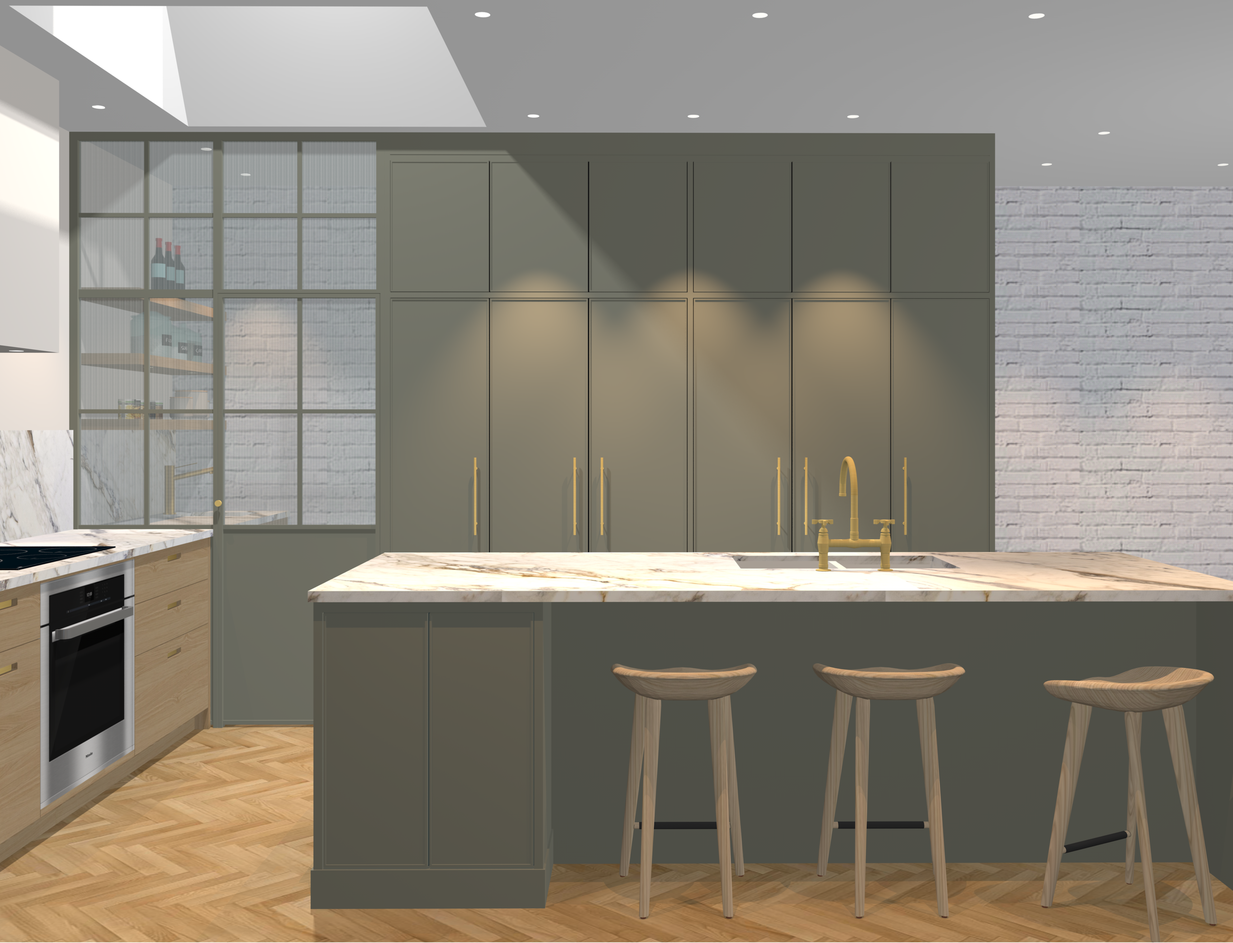
Earthy
The most saturated of this family with shades of brown and green, earthy has its source in the soil and large pastures. Dark and deep, it is the perfect beige to contrast against white and create a warm minimalist atmosphere.
The Greens
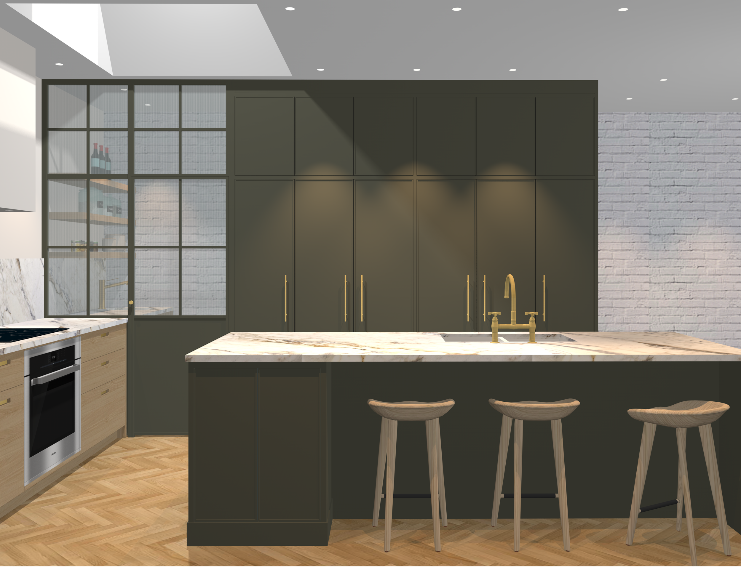
Trendy for a few years now, green is always popular with our designers! Green belongs to the cold color family, but the feeling that emanates from it is anything but cold and dull. This color brings a touch of nature and a breath of fresh air to the kitchen.
In addition to being a color that whets the appetite, green can even act as an anti-stress element in a room by creating a relaxing and comforting atmosphere. You live in the city and dream of nature? Use green to get away from your urban environment and find the perfect balance! Which of our three greens inspires you?
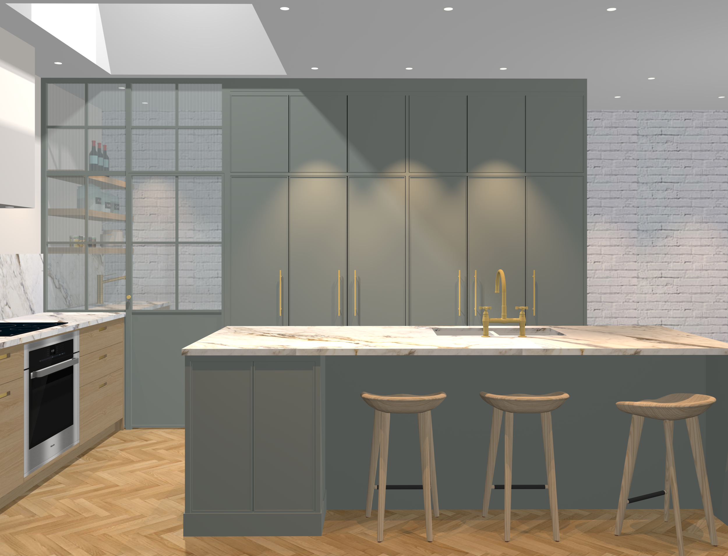
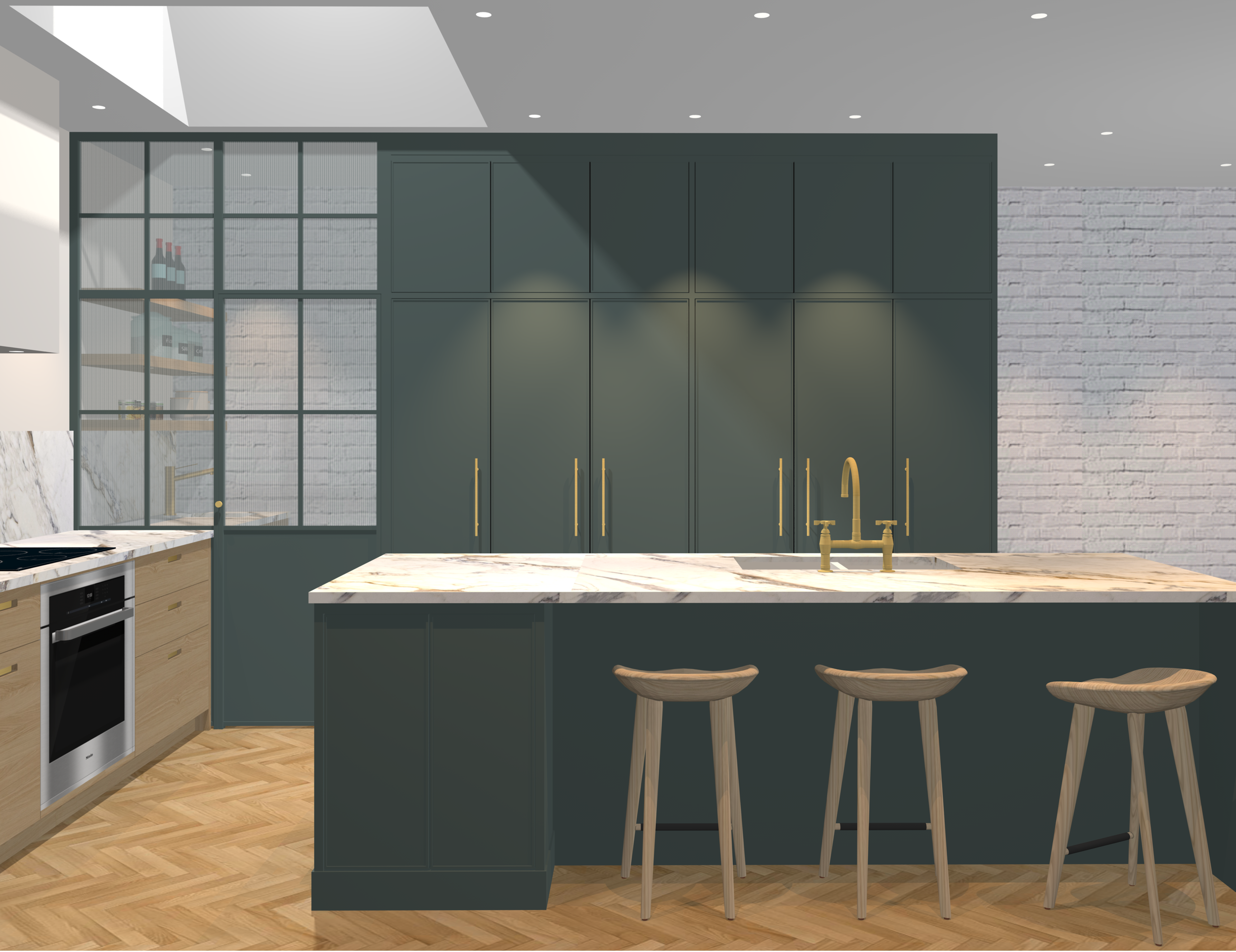
Winter
A green inspired by winter landscapes in the mountains, sleeping nature under the snow. Halfway between green and grey, between the liveliness of nature and the sobriety of greyness, winter becomes in a way a classic neutral tone with a touch of originality. Set side by side with white, it is surprisingly luminous.
St Louis
Named for Lake St-Louis located southwest of Montreal, this color is synonymous with the reflection of the trees and the wind effect on the water. On a sunny day, the full warmth and depth of this hue can be seen. This rich shade can subtly redefine the atmosphere of the kitchen at any time of the day.
Pine needle
Our more intense version of green, pine needle, takes its inspiration from the hollow of the forest. A muted and elegant shade that goes perfectly with noble materials such as marble, terrazzo and brass. With its yellow pigments, this color also adapts to natural textures and materials.
The Blues
Like green, blue belongs to the cool color palette. This primary color shines with its many shades and can transform a room, giving it a sense of depth and grandeur. Divine, dreamy and serene like the sky or enveloping and captivating like the depths of the sea, the variations of blue are almost infinite. Its pairings are too, both in terms of color combinations and selected materials.
Blue also has the power to refresh a room that benefits from a southern exposure. Our team has developed three shades of blue that will add dimension to your kitchen; original, modern and sophisticated blues. Check them out here!
Algae
With its undertones of green, this color perfectly combines the freeing feeling of blue and the calming effect of green. The reflection of the sun on the seabed, algae is part of the line of reinvented classic colors, which will keep its cachet and its class year after year!
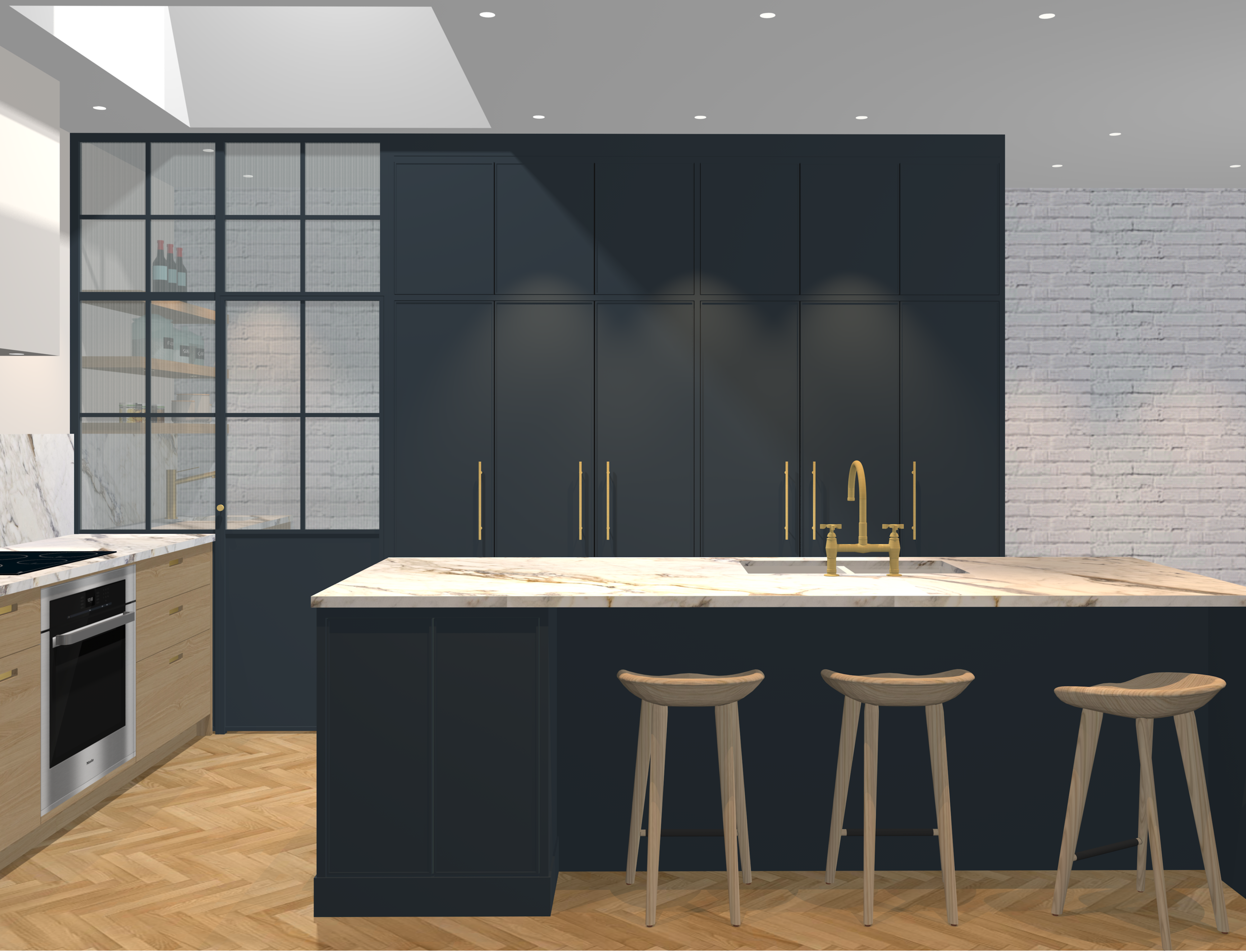
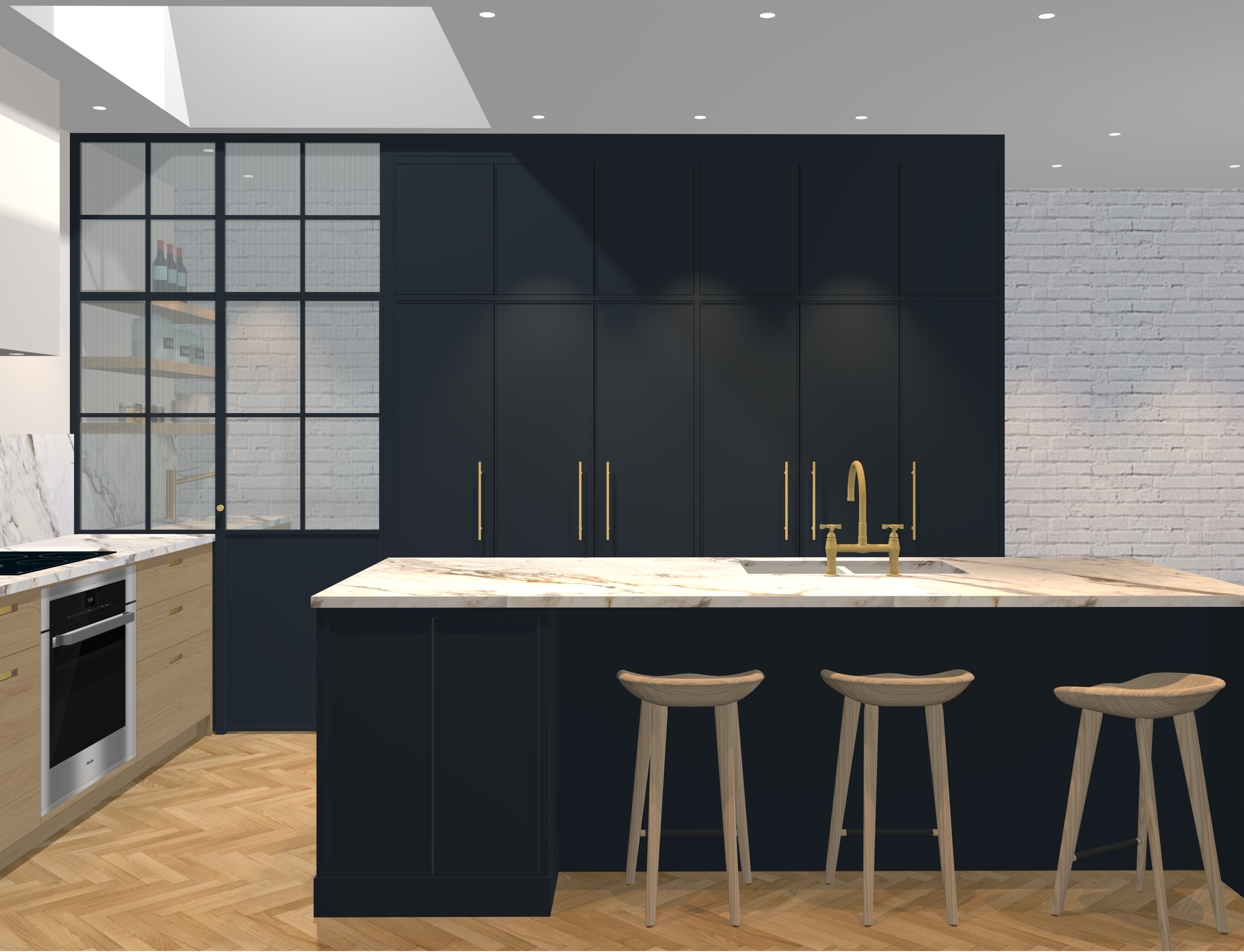
Turquin
A deep, slate-like matte blue, this profound, velvety shade is our most saturated blue composition. Both romantic and mysterious, this peaceful color has all the assets to refine your kitchen and give it a modern feel.
Celestial
This color takes its inspiration from the sky, it refers to distant atmosphere layers. There are subtle gray undertones. Harmoniously paired with our shades of beige, celestial reveals a brighter tone and a more delicate look.
The Blacks

Enigmatic, black is synonymous with elegance and refinement! It is not part of the color spectrum, it is the total absence of light. It is the ideal companion to highlight warm or cold colors. Distinguished, it forms a graphic duo that is both modern and classic when paired with white.
Far from being dull and boring, black has this ability to dictate the intensity of a space. With its help, the kitchen can become an intimate, rich and cozy place or a graphic, sharp and minimalist space. Discover our three equally attractive shades of black!
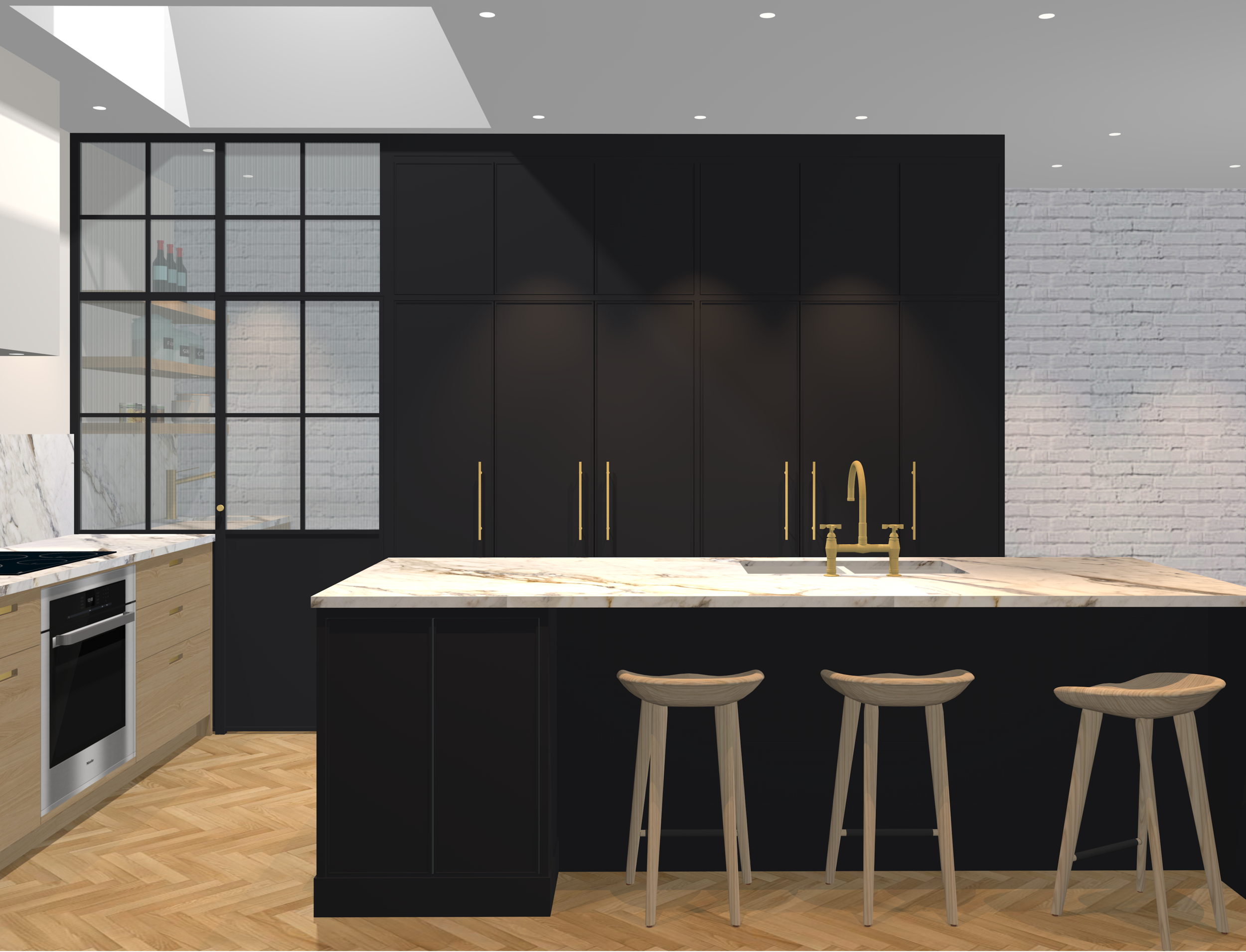
Rain
A comforting black, like heavy showers on a fall Sunday afternoon when our only desire is to settle down comfortably under a blanket and listen to the sound of rain drops. Gray hues give this color a softer, less austere personality and lends its untold power in the heart of your home.
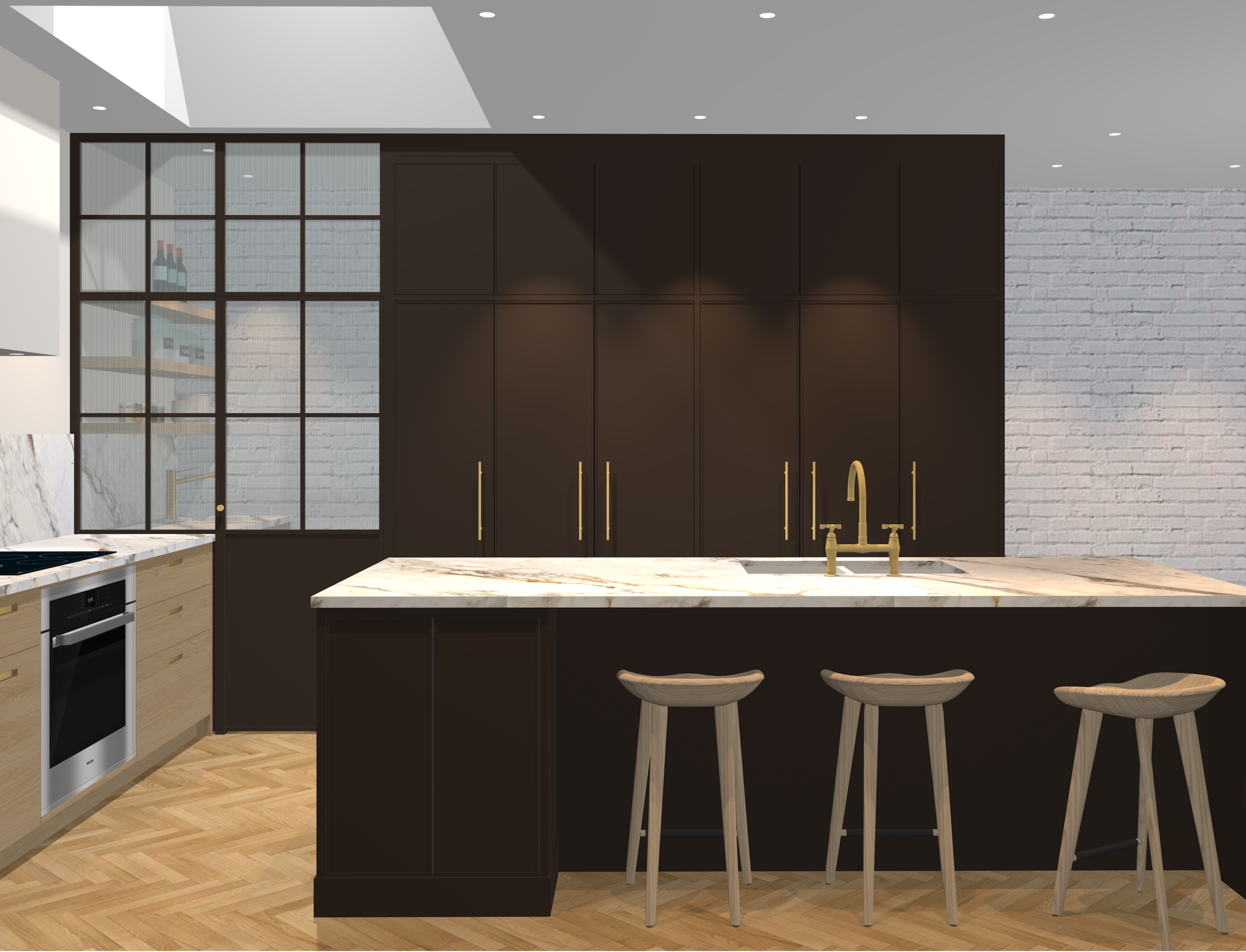
Mousse
Our most captivating, copious and silky proposal stands out as a warm alternative to classic black. Mousse, like chocolate mousse, is the shade of choice for a kitchen with a natural, authentic and luxurious atmosphere.
Franc
It is a sharp black that leaves no one indifferent. Under sunlight, this shade reveals a hint of brown, a subtle warming effect without losing its intensity. Franc, becomes a major ally for marked contrasts!
Endless combinations
Together, these fifteen 2022 trend colors form a coherent universe that is rich and full of design possibilities. Whether you are looking for contrasts or harmonies, these colors have all been developed with the intention of being able to jointly bring your space to life.
We invite you to come and discover this colorful universe in our showroom to discover all its subtleties.